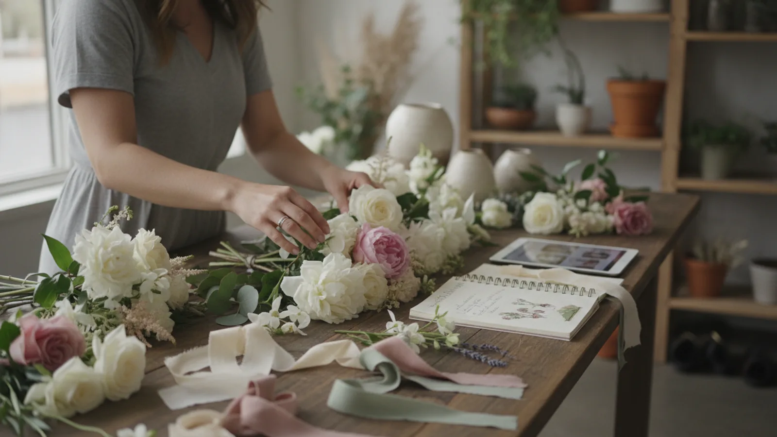
Fresh Flower Bouquet Colour Ideas
A practical step-by-step guide to fresh flower bouquet colour ideas, including preparation, instructions, common issues, tips, and next steps.

Fresh Flower Bouquet Colour Ideas
Choosing the perfect colours for a fresh flower bouquet can transform it from lovely to truly unforgettable. This guide will walk you through understanding colour theory, matching palettes to occasions, and selecting flowers that express exactly what you want to say. Whether you're gifting for a birthday, celebrating a wedding, or simply brightening your home, mastering colour ideas will help you create stunning floral arrangements every time.
Fast Answer
- Start Point: Choose a main flower or desired mood.
- Key Principle: Balance warm (red, orange, yellow) and cool (blue, purple, green) tones.
- Best for Gifts: Consider the recipient's favourite colours and the occasion's meaning.
Before You Start
- A clear idea of the occasion: This helps set the mood for your colour choices.
- Consider the recipient: Think about their favourite colours or the overall aesthetic they appreciate.
- A rough budget: This might influence the types of flowers you can choose, and thus their available colours.
- Access to inspiration: Look at photos of bouquets online, in magazines, or even in local florists.
- Basic understanding of the colour wheel: Knowing primary, secondary, and tertiary colours can make decision-making much easier.
- Knowledge of flower availability: Seasonal flowers often offer the best value and freshest look, guiding natural colour palettes.
Step-by-Step Instructions
Understand Basic Colour Theory
Before you dive into picking specific flowers, it's incredibly helpful to grasp some fundamental colour principles. This isn't about memorising complicated charts, but understanding how colours relate to each other. The colour wheel is your best friend here. It shows you primary colours (red, blue, yellow), which can't be made by mixing others. Then there are secondary colours (orange, green, purple), made by mixing two primaries. Tertiary colours are a mix of a primary and a secondary.
Beyond this, colours are generally split into two main groups: warm colours like reds, oranges, and yellows, which evoke feelings of energy and happiness; and cool colours such as blues, purples, and greens, which tend to be calming and peaceful. Understanding this distinction helps you set the overall mood of your bouquet from the start. For example, a bouquet dominated by warm tones will feel vibrant, while one with cool tones will feel serene.
Choose Your Dominant Colour
Every great bouquet usually starts with a main colour, a star if you will. This dominant colour will set the tone and often comes from your favourite flower or a colour that suits the occasion. For example, if you're creating a romantic bouquet, you might choose a deep red rose as your dominant colour. For a cheerful birthday gift, a bright yellow sunflower could be your starting point.
Once you have this main colour in mind, it becomes easier to select supporting colours that either enhance it or provide a pleasing contrast. Don't be afraid to pick a bold colour as your anchor; often, it's the brave choice that makes a bouquet truly stand out. Think about what emotion you want to convey. A vibrant pink tulip might suggest joy, while a soft lavender might speak of gentle admiration.
Explore Colour Harmonies for Impact
Now that you have your dominant colour, it's time to build a harmonious palette around it using established colour schemes. There are a few tried-and-true methods:
- Monochromatic: This uses different shades and tints of a single colour. Think a bouquet with light pink roses, medium pink carnations, and deep fuchsia snapdragons. It creates a sophisticated, elegant look.
- Analogous: Combines colours that are next to each other on the colour wheel. For example, a blend of yellow, orange, and red flowers evokes warmth and harmony. This is a very pleasing and natural-looking combination.
- Complementary: Uses colours directly opposite each other on the colour wheel, like red and green, or blue and orange. This creates a high-contrast, vibrant, and energetic bouquet that really pops. Use one colour dominantly and the other as an accent.
- Triadic: Involves three colours equally spaced around the colour wheel, such as red, yellow, and blue. This creates a bold, playful, and balanced look. It can be tricky but very rewarding when done well.
Consider which harmony best fits the message or mood you want to send. A monochromatic scheme can be peaceful, while complementary colours are dynamic.
Match Colours to the Occasion
The event or reason for gifting flowers is a huge factor in your colour selection. Different occasions call for different emotional tones, which can be expressed through colour.
- Weddings: Often feature soft pastels (pinks, creams, whites) for romance and purity, or bold, rich colours (burgundy, emerald) for drama and luxury. Consider the bridal party's outfits and venue decor.
- Birthdays: Can be bright and cheerful (mixed vibrant colours like yellows, oranges, hot pinks) or tailored to the recipient's favourite hue.
- Sympathy/Condolence: Typically use calming, respectful colours such as whites, creams, soft blues, purples, or muted greens. These convey peace and remembrance.
- Anniversaries: Often lean towards romantic reds and pinks, or elegant whites and purples, reflecting enduring love and commitment.
- New Baby: Traditionally blue for boys and pink for girls, but modern choices include cheerful yellows, greens, and mixed pastels.
- 'Just Because' / Home Decor: This is where you can be most creative! Choose colours that complement the room's existing palette or simply make you happy.
Thinking about the occasion first helps narrow down your choices and ensures your bouquet sends the right message.
Incorporate Texture and Greenery
Colour isn't the only thing that makes a bouquet interesting; texture and greenery play a vital role too. Greenery isn't just a filler; it acts as a natural separator between colours, allowing each flower to stand out. It also provides a refreshing contrast, especially when using vibrant colours.
Varying textures, such as the smooth petals of a rose against the fluffy appearance of a dianthus or the delicate lace of a gypsophila, add depth and visual interest. Even within the same colour family, different textures can create a more dynamic look. For example, a bouquet of all white flowers can be incredibly rich and engaging if it includes flowers with varied textures, like lilies, hydrangeas, and snapdragons.
Consider different shades of green in your foliage too – from deep forest green eucalyptus to the lighter, feathery asparagus fern. This subtle variation adds another layer of sophistication to your chosen colour scheme.
Balance Brightness and Tone
The intensity, or brightness, of your chosen colours is just as important as the colours themselves. A bouquet filled with only very bright, saturated colours can sometimes feel overwhelming. Conversely, a bouquet with only muted, pale tones might lack impact.
The trick is to find a balance. If you have a few very vibrant "statement" flowers, balance them with softer, more subdued tones or plenty of neutral greenery. For instance, a bright orange gerbera might be paired with softer peach roses and creamy white stocks. This allows the vibrant colour to pop without dominating the entire arrangement.
Also, consider the 'tone' of the colour – is it a cool red or a warm red? A clear blue or a grey-blue? Mixing tones carelessly can lead to a messy look. Stick to generally warm-toned flowers together, or cool-toned flowers together, unless you are intentionally creating a strong, contrasting impact with complementary colours.
Visualise and Adjust Your Palette
Once you have a few colour ideas in mind, take a moment to visualise how they will look together. If you're at a florist, ask to hold a few chosen stems together. If you're planning online, look at pictures of the specific flower varieties in your chosen colours.
Don't be afraid to make adjustments. Sometimes what looks good in theory doesn't quite work in practice. Maybe one colour is too dominant, or another gets lost. Perhaps a touch of white or cream is needed to "lift" a darker palette, or a pop of bright yellow could add cheer to a subtle scheme. This stage is all about trial and error, refining your vision until it feels just right. Trust your instincts and remember the mood you want to create.
Consider Seasonal Availability
While modern floristry allows for a wide range of flowers year-round, opting for seasonal blooms often means fresher flowers, better quality, and more cost-effective prices. Seasonal availability naturally guides colour palettes too.
- Spring: Think fresh pastels – soft yellows, delicate pinks, lavenders, and whites. Tulips, daffodils, hyacinths, and ranunculus are abundant.
- Summer: Bright and bold colours take centre stage – vibrant reds, oranges, deep blues, and sunny yellows. Sunflowers, delphiniums, sweet peas, and hydrangeas thrive.
- Autumn: Warm, earthy tones dominate – rich oranges, deep reds, golden yellows, rustic browns, and forest greens. Chrysanthemums, dahlias, and autumnal foliage are popular.
- Winter: Elegant whites, deep reds, silvers, and rich greens are classic. Amaryllis, hellebores, and festive foliage are beautiful choices.
Embracing seasonal flowers means your bouquet will feel perfectly in tune with nature and the time of year, adding another layer of thoughtful design to your colour choices.
Quick Reference
| Situation | Use this | Why |
|---|---|---|
| Romantic Gesture | Red & Pink shades | Classic symbols of love and affection. |
| Cheer Up/Birthday | Yellow, Orange & Bright Pink mix | Evokes joy, energy, and celebration. |
| Sympathy/Condolence | White, Cream, Soft Blue & Lavender | Conveys peace, purity, and respect. |
| Modern/Sophisticated | Monochromatic or Analagous with neutrals | Creates a refined, elegant look. |
| Energetic/Dynamic | Complementary colours (e.g., Orange & Blue) | High contrast creates a vibrant 'pop'. |
| Home Decor (Calming) | Cool tones (Blues, Greens, Purples) | Promotes relaxation and serenity. |
Common Problems When You Fresh Flower Bouquet Colour Ideas
- Colours Clashing:
Problem: Your chosen colours might look great individually but create an unpleasant visual when put together, often appearing messy or overly busy. This usually happens when too many vibrant, strong colours are used without enough neutral space or a clear dominant colour.
Fix: Introduce more greenery or neutral flowers (like white or cream) to provide visual breaks. Re-evaluate your colour harmony – are you trying to combine too many different schemes? Stick to one primary colour scheme (e.g., analogous, complementary) and use other colours sparingly as accents. Sometimes, simply reducing the number of different colours can make a huge difference.
- Bouquet Looks Flat or Uninteresting:
Problem: The colours in your bouquet might be pleasant, but the overall arrangement lacks excitement, depth, or visual appeal. This can happen when all colours are of a similar tone or brightness, or when there's no variation in texture.
Fix: Add variety! Introduce a flower with a contrasting texture (e.g., a spiky delphinium among soft roses). Vary the brightness by including both deeply saturated colours and paler tints. Consider adding a complementary colour as a small accent to create a point of interest and make the main colours pop.
- Not Matching the Occasion or Recipient:
Problem: You've created a beautiful bouquet, but its colours don't quite fit the event's mood (e.g., bright tropical for a sombre occasion) or the recipient's known preferences.
Fix: Before selecting, clearly define the occasion and who it's for. If unsure about personal preference, opt for universally pleasing palettes like soft pastels, classic whites and greens, or a cheerful mix of brights that are generally well-received. Research common colour meanings associated with specific events to ensure your message is clear.
- Overpowering Certain Flowers:
Problem: A very strong, dominant colour or flower might completely overshadow other beautiful blooms in your bouquet, making them disappear visually.
Fix: Use your strongest colours in smaller quantities or as focal points, rather than making them the majority. Distribute strong colours evenly throughout the bouquet instead of clumping them. Balance powerful colours with softer, lighter shades or ample greenery to let each bloom have its moment to shine.
Advanced Tips for Fresh Flower Bouquet Colour Ideas
- Play with Colour Saturation and Desaturation: Don't just think about hue (the colour itself), but also its saturation (intensity). A desaturated, muted purple can look incredibly sophisticated next to a vibrant green, creating a very different feel than a bright purple and bright green. Experiment with 'dusty' or 'vintage' tones alongside brighter pops for a richer, more complex palette.
- Embrace the Power of Neutrals: White, cream, and various shades of green aren't just fillers; they are powerful design tools. Using a significant amount of neutral tones can make even the most vibrant colours stand out more clearly and give the bouquet a refined, elegant air. They provide visual resting places and prevent sensory overload.
- Consider the Vase or Wrapping: The container or wrapping you choose is an extension of your colour palette. A rustic brown paper wrap can enhance autumnal tones, while a clear glass vase lets the flowers speak for themselves. A coloured vase can either complement or contrast with your bouquet, adding another layer to your overall design. Think about the final display.
- Look Beyond Just Petal Colours: Pay attention to the colours of stems, leaves, and even the flower centres. Some flowers have beautiful contrasting centres (e.g., certain daisies or anemones), or unique coloured stems that can add unexpected visual interest and tie into your palette. This detail adds depth and thoughtfulness to your arrangement.
- Create Ombre or Gradient Effects: For a truly striking and modern look, try an ombre effect where colours seamlessly blend from light to dark, or from one hue to another (e.g., soft peach fading into deep coral, or light blue transitioning to deep indigo). This requires careful selection of different shades of the same flower or flowers with similar forms.
- Draw Inspiration from Art and Nature: Look at paintings, fashion, or natural landscapes (a sunset, a forest floor) for unexpected but beautiful colour combinations. Nature, in particular, rarely clashes and can provide endless harmonious palettes that you can translate into your floral designs.
Fresh Flower Bouquet Colour Ideas FAQ
- How do I choose colours for a mixed bouquet with many different flowers?
Start with one or two dominant colours that you love or that suit the occasion. Then, select a colour harmony (like analogous or complementary) to guide the rest of your choices. Use different flowers within those chosen colours, and always add plenty of varying greenery to tie everything together and prevent a cluttered look.
- What colours are best for a sympathy bouquet to convey respect?
For sympathy, it's best to stick with soft, muted, and peaceful colours. Whites, creams, light blues, lavender, and gentle pale greens are traditional choices that convey peace, remembrance, and comfort without being overly showy. Avoid bright reds or oranges unless specifically requested by the family.
- Can I use only one colour for my fresh flower bouquet?
Absolutely! A monochromatic bouquet, using various shades and tints of a single colour (e.g., light pink, medium pink, and deep fuchsia), can be incredibly elegant, sophisticated, and impactful. It creates a very cohesive and luxurious look, often highlighting the texture and form of the individual flowers more effectively.
- How do seasonal flowers affect my colour choices?
Seasonal availability often dictates the freshest and most vibrant colours. Spring tends to bring pastels, summer offers bold brights, autumn delivers warm earthy tones, and winter leans into classic whites, reds, and deep greens. Embracing seasonal flowers means your bouquet will naturally align with the time of year and often be more affordable and longer-lasting.
- Should I consider the recipient's personality when choosing colours?
Yes, definitely! Thinking about the recipient's personality, style, and favourite colours can make your bouquet even more meaningful. For a vibrant, outgoing person, bright and bold colours might be perfect. For someone more serene, soft pastels or cool tones could be ideal. A personal touch always makes a gift more special.
Final Checklist for Fresh Flower Bouquet Colour Ideas
- Occasion Considered: Have you chosen colours appropriate for the event?
- Recipient in Mind: Do the colours suit the person you're gifting to?
- Dominant Colour Chosen: Is there a clear star colour in your bouquet?
- Colour Harmony Applied: Have you used monochromatic, analogous, or complementary schemes?
- Balance of Brightness: Are there varying levels of intensity to add interest?
- Texture and Greenery Included: Does the bouquet have varied textures and foliage for depth?
- Visualisation Done: Have you imagined or seen the colours together to ensure they work?
- Seasonal Check (Optional but Recommended): Are you using seasonal blooms for freshness and value?
- Message Clear: Do the colours effectively convey the emotion you intend?
- No Clashes Spotted: Have you double-checked for any colours that might jar or fight each other?
What should I check before acting on advice about fresh flower bouquet colour ideas?
Use this guide as a starting point, compare current specifications and costs, and check the details that apply to your own situation before making a purchase or booking.
Where can I find related floristry guidance?
Browse the related guides in this section for practical comparisons, planning notes, and next steps that support the same decision.